
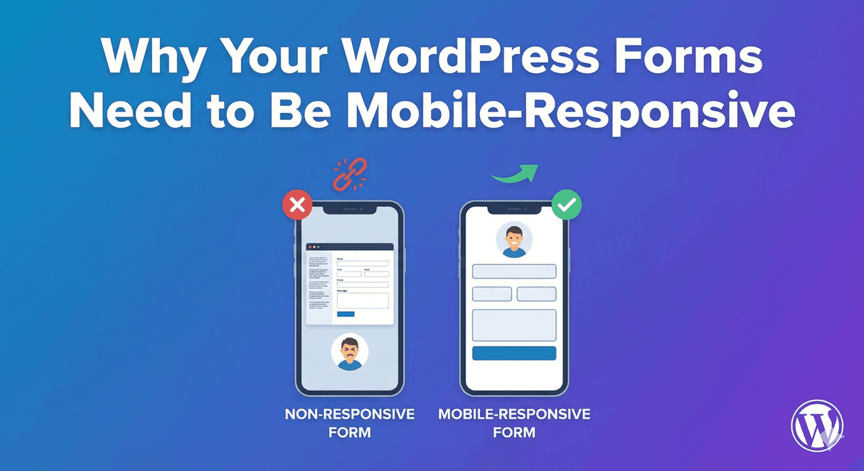
Last updated: Last update 18 August More than half of all website traffic now comes from smartphones and tablets. Yet many WordPress contact forms still look and behave like they were built for a desktop monitor — tiny text fields, side-by-side layouts that overflow the screen, and submit buttons that are hard to tap with a thumb. If your forms are not mobile-responsive, you are losing submissions every day. Visitors who struggle to complete a form on their phone do not email you instead — they leave. This guide explains why mobile-responsive WordPress forms matter, what goes wrong when they are not, and how to build forms that work beautifully on every screen size. A mobile-responsive form adapts its layout, field sizes, and interactive elements to fit the screen it is displayed on. On a desktop monitor, a form might show two columns side by side. On a phone, those same fields stack into a single column with full-width inputs large enough to tap comfortably. Mobile responsiveness is not just about shrinking a desktop layout. It means: A form that looks fine on your laptop but breaks on an iPhone is not mobile-responsive — no matter what your theme claims. Whether your traffic comes from Google search, social media, paid ads, or email campaigns, a large share of visitors arrive on a phone. Google uses mobile-first indexing, meaning it primarily evaluates the mobile version of your pages for search rankings. A form that fails on mobile can hurt both conversions and SEO. Mobile visitors are often in a different mindset — browsing during a commute, responding to a social post, or following up on a recommendation. They expect to complete a form in under a minute with minimal friction. Every extra tap, every field they cannot reach, and every layout that requires horizontal scrolling is a reason to abandon the form. Your form is often the last step in a conversion funnel. A contact form, quote request, event registration, or newsletter signup is where interest becomes action. If that final step feels broken on mobile, everything before it — your landing page, your ad spend, your content — loses value. Mobile responsiveness overlaps with accessibility. Larger touch targets, readable text, and logical field stacking help not only phone users but also visitors with motor difficulties, older users, and anyone using a tablet in portrait mode. Non-responsive forms create predictable problems. Here is what visitors experience — and why they leave: Each of these is a conversion killer. And they are all avoidable with a form plugin built for mobile from the start. Auto Form Builder lets you create multi-step forms, calculators, and lead capture forms in WordPress, then embed them on any site with a single line of code. The data is consistent across industries: For WordPress site owners, this means mobile form design is not a nice-to-have feature — it is a core requirement. Every contact form, lead capture form, registration form, and survey on your site should be tested and optimized for phones and tablets before it goes live. Not every WordPress form plugin handles mobile equally. Before you choose — or before you assume your current plugin is fine — check for these capabilities: Auto Form Builder is built with mobile responsiveness as a core feature — not an afterthought. Here is how it ensures your forms work on every device. Both the form builder and the Customize tab include a live device preview. Switch between desktop, tablet, and mobile views to see exactly how your form will look before you publish. Styling changes — colors, fonts, header images, button design, backgrounds — update in real time across all three viewports. Auto Form Builder forms use responsive CSS that adapts automatically: You do not need to write custom CSS or install a separate responsive add-on. Every field type in Auto Form Builder is designed for touch input: Forms with header images or banners automatically adjust on small screens. On phones, header images switch from cover to contain mode so the full image stays visible without cropping the sides — matching what you uploaded, not a cropped fragment. When a visitor submits an invalid form on mobile, Auto Form Builder: This prevents the common mobile frustration of submitting a form, seeing a generic error at the top, and not knowing which field to fix. Auto Form Builder forms carry their own scoped CSS. They are not dependent on your WordPress theme for layout or appearance. This matters on mobile because many themes apply aggressive CSS resets or minimal styling that breaks form layouts — especially on themes like Hello Elementor. Auto Form Builder forms display correctly regardless of the theme, page builder, or host site styles. A built-in viewport manager detects screen size, orientation, and device type at runtime. It applies the correct responsive classes and CSS custom properties so forms adapt when a visitor rotates their phone, resizes their browser, or views the form on a tablet in portrait mode. Forms embedded on external websites — non-WordPress sites, landing pages, client portals — automatically resize to fit their container with no inner scrollbar. The embedded form keeps the design you built and adapts to whatever screen the host page is viewed on. Mobile responsiveness travels with the embed code. The Name field supports stacked or side-by-side first/last name layout. Choose stacked for mobile-first forms where single-column flow is the priority, or side-by-side for desktop-heavy audiences — the responsive CSS handles the reflow either way. Even with a responsive form plugin, how you design your forms affects mobile completion rates. Follow these practices: Before publishing any form, run through this checklist: In Auto Form Builder, open your form and switch the preview to mobile view in the builder or Customize tab. Check that all fields stack correctly, the submit button is visible without scrolling, and header images display fully. Open the page with your form on an iPhone and an Android phone. Fill out every field, trigger validation errors intentionally, upload a file, and submit. Confirm the success message or redirect works. Rotate the device and confirm the form reflows without breaking. Auto Form Builder’s viewport manager handles orientation changes, but a quick manual check catches edge cases. If you use the embed code on an external site, open that page on mobile and confirm the form resizes to fit and all fields remain usable. Slow-loading forms on mobile networks lose visitors before they even see the first field. Keep your form page lean and test load time on a throttled mobile connection using Google PageSpeed Insights or your browser’s network throttling tools. Not always. It depends on the form plugin and your theme. Many form plugins output basic HTML that relies on your theme’s CSS for responsive behavior — and many themes do not style forms well on mobile. Auto Form Builder includes its own responsive CSS and device preview, so forms adapt correctly regardless of your theme. Use a form plugin with built-in responsive design, like Auto Form Builder. Keep forms short, use single-column layouts, enable touch-friendly CAPTCHA (Cloudflare Turnstile), and test on a real phone before publishing. The Customize tab’s mobile preview lets you verify the design before going live. Yes. Google uses mobile-first indexing, meaning it evaluates the mobile version of your pages for search rankings. A poor mobile form experience increases bounce rate and reduces conversions — both signals that affect how Google perceives your page quality. Yes. Auto Form Builder’s form builder and Customize tab both include desktop, tablet, and mobile preview modes. Switch between device views to see exactly how your form will render on each screen size — including styling, layout, and field behavior. Yes. Auto Form Builder embed codes produce forms that automatically resize to fit their container on any device. The embedded form keeps your original design and stays isolated from the host site’s styles, so it displays correctly on phones, tablets, and desktops. Yes. Auto Form Builder’s Signature field supports touch input. Visitors can sign with a finger or stylus on phones and tablets, and the signature is saved as an image with the submission. Cloudflare Turnstile is the most mobile-friendly option. It is privacy-first, usually invisible to real visitors, and does not require tapping tiny images in a grid. Auto Form Builder includes Turnstile as a free built-in add-on, alongside Google reCAPTCHA. Usually because the form plugin uses fixed-width layouts or multi-column designs without responsive breakpoints. Auto Form Builder automatically stacks columns and rows into a single-column layout on screens 768px and below, preventing horizontal overflow. Auto Form Builder lets you create multi-step forms, calculators, and lead capture forms in WordPress, then embed them on any site with a single line of code. Your visitors are on their phones. Your forms should be too. Auto Form Builder gives you responsive layouts, touch-optimized fields, device preview, inline validation, and embed codes that work on every screen — all included free. Install Auto Form Builder from WordPress.org and use the mobile preview to see your first form on every device. Or try the live demo on your phone right now.Why Your WordPress Forms Need to Be Mobile-Responsive
What Does Mobile-Responsive Mean for Forms?
Why Mobile-Responsive Forms Matter
Most Visitors Are on Mobile
Mobile Users Convert Differently
First Impressions Happen on Small Screens
Accessibility and Inclusivity
What Happens When Forms Are Not Mobile-Friendly
Build forms that embed anywhere — free
The Mobile Reality for WordPress Sites
What to Look for in a Mobile-Responsive Form Plugin
How Auto Form Builder Handles Mobile Responsiveness
Desktop, Tablet, and Mobile Preview
Automatic Layout Reflow
Touch-Optimized Field Types
Smart Header and Image Scaling
Inline Validation with Auto-Scroll
Theme-Independent Styling
Viewport-Aware Rendering
Embed Forms That Resize on Any Device
Name Field Layout Control
Best Practices for Mobile-Friendly WordPress Forms
How to Test Your Forms on Mobile
Step 1: Use the Built-In Device Preview
Step 2: Test on a Real Device
Step 3: Test in Portrait and Landscape
Step 4: Test Embedded Forms
Step 5: Check Page Speed
Frequently Asked Questions
Are WordPress forms mobile-responsive by default?
How do I make my WordPress contact form mobile-friendly?
Does mobile responsiveness affect SEO?
Can I preview my form on mobile before publishing?
Do embedded forms work on mobile?
Do signature fields work on touchscreens?
What is the best CAPTCHA for mobile forms?
Why do my form fields overflow on mobile?
Build forms that embed anywhere — free
Build Mobile-Responsive Forms Today
Table of Contents
Table of Contents
Learn how conditional logic improves form conversion rates. Discover why shorter, personalized forms get more completions and better quality leads.
Learn about Western vs Eastern name order in form design. Create inclusive forms that handle international name formats correctly.
Learn how to add range sliders to WordPress forms. Create interactive number selection with visual sliders for budgets, ratings, quantities, and more.
Learn conditional logic best practices for WordPress forms. Create better user experiences by showing relevant fields and hiding unnecessary ones.
Learn how to create form sections using HTML blocks in WordPress. Organize long forms with headings, dividers, and visual groupings for better UX.
Discover why conditional logic is essential for WordPress forms. Boost conversions, collect better data, and create personalized user experiences.
Learn how to add a date picker to WordPress forms. Create user-friendly date selection with calendars, format options, and date restrictions.
Learn how to add a 'Select All' option to checkbox lists in WordPress forms. Let users quickly select every option with one click for better UX.
Learn how to create searchable dropdown fields in WordPress forms. Help users quickly find options in long lists with type-to-search functionality.
Learn when to use radio buttons vs dropdown menus in WordPress forms. Choose the right selection field based on options count, space, and user experience.