Conditional Logic Best Practices for Better UX

Conditional logic transforms static forms into smart, responsive experiences. Show fields when relevant, hide them when not. But poor implementation creates confusion—fields appearing unexpectedly, required fields hidden, or so many conditions the form becomes unpredictable. Good conditional logic feels invisible; users simply see what they need, when they need it.
In this guide, you’ll learn best practices for implementing conditional logic that improves user experience rather than complicating it.
What is Conditional Logic?
The Basic Concept
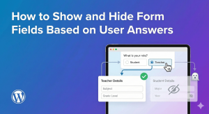
Conditional logic shows or hides form fields based on user answers:
- IF user selects “Yes”
- THEN show follow-up question
- ELSE keep it hidden
Why It Matters for UX
- Shorter perceived form length
- Only relevant questions shown
- Reduces cognitive load
- Faster completion time
- More accurate data collection
Common Use Cases
- Show “Other” text field when “Other” is selected
- Show company fields for business inquiries
- Show shipping address when different from billing
- Show additional questions based on service type
- Show file upload for specific request types
Best Practice #1: Keep Forms Short by Default
The Principle
Start with minimal visible fields. Add more only when needed.
Why It Works
- Users see a short, approachable form
- Less overwhelming first impression
- Higher form start rates
- Fields appear contextually relevant
Example: Contact Form
Always visible (4 fields):
- Name
- Inquiry Type (dropdown)
- Message
Conditionally shown:
- Company Name → IF Inquiry Type = “Business”
- Phone Number → IF Inquiry Type = “Sales” or “Support”
- Order Number → IF Inquiry Type = “Support”
- Budget Range → IF Inquiry Type = “Sales”
Result
Personal inquiries see 4 fields. Business inquiries see 5-6. Support sees 5. Each user gets exactly what’s relevant.
Best Practice #2: Use Clear Trigger Questions
The Principle
The field that triggers conditions should be unambiguous.
Good Trigger Questions
- “Are you an existing customer?” (Yes/No)
- “Inquiry type” (Clear categories)
- “Do you need shipping?” (Yes/No)
- “Select your plan” (Defined options)
Poor Trigger Questions
- Open text fields (unpredictable answers)
- Vague options (users unsure what to pick)
- Too many options (overwhelming)
- Overlapping categories (confusion)
Best Field Types for Triggers
- Radio buttons – Clear single choice
- Dropdown – Clean, defined options
- Checkbox – Yes/no or multi-select
Best Practice #3: Show Fields Immediately Below Trigger
The Principle
Conditional fields should appear right after the question that triggered them.
Why Position Matters
- Users see cause and effect
- Natural reading flow maintained
- No surprise fields at form end
- Context is preserved
Good: Sequential Flow
Are you an existing customer?
○ Yes  ○ No

[IF YES - appears here]
Customer ID: [________]

Email: [________]
Message: [________]
Bad: Disconnected Position
Are you an existing customer?
○ Yes  ○ No

Email: [________]
Phone: [________]
Message: [________]

[IF YES - appears way down here]
Customer ID: [________]  ← Confusing!
Best Practice #4: Avoid Nested Conditions When Possible
The Principle
Keep condition chains short. Deep nesting creates complexity.
Acceptable: One Level
IF "Need delivery" = Yes
  SHOW Delivery Address
Acceptable: Two Levels
IF "Need delivery" = Yes
  SHOW Delivery Address
  IF "Different from billing" = Yes
    SHOW Billing Address
Problematic: Deep Nesting
IF "Customer type" = Business
  IF "Company size" = Enterprise
    IF "Industry" = Technology
      IF "Department" = Engineering
        SHOW Technical Contact Field
Why Deep Nesting Fails
- Hard to debug
- Confusing for users
- Easy to create logic errors
- Difficult to maintain
Alternative: Flatten with Multiple Conditions
Instead of nested IF statements, use AND conditions:
SHOW Technical Contact IF:
  Customer type = Business AND
  Company size = Enterprise AND
  Industry = Technology AND
  Department = Engineering
Best Practice #5: Handle Required Fields Carefully
The Principle
Hidden fields should not be required. Visible fields can be required.
The Problem
If a required field is hidden by conditional logic, users can’t fill it and can’t submit the form.
Solution: Conditional Required
- Field is required only when visible
- Hidden = not validated
- Shown = validates normally
Example
Company Name: [________]
- Show IF: Inquiry Type = "Business"
- Required IF: Visible

When hidden: Not required, not validated
When shown: Required, must be filled
Test This Scenario
- Hide the conditional field
- Try to submit
- Form should submit successfully
- No “required field” errors for hidden fields
Best Practice #6: Provide Visual Feedback
The Principle
When fields appear/disappear, make it smooth and noticeable.
Good Visual Feedback
- Smooth animation: Slide or fade in
- Subtle highlight: Brief background color
- Scroll adjustment: Keep visible area stable
Poor Visual Feedback
- Instant pop: Jarring appearance
- Page jump: Content shifts unexpectedly
- No indication: User doesn’t notice new field
Animation Tips
- 150-300ms duration feels responsive
- Fade + slide is professional
- Don’t animate too slowly (annoying)
Best Practice #7: Don’t Hide Too Much
The Principle
Some fields should always be visible for context.
Always Visible
- Primary contact info (name, email)
- The main purpose field (message, request)
- Submit button
- Privacy/consent checkboxes
Good Candidates for Hiding
- Follow-up details
- “Other” specification fields
- Optional additional info
- Secondary contact methods
- Conditional file uploads
Bad: Hiding Core Fields
Don’t hide the email field based on some condition—you probably always need it.
Best Practice #8: Use “Show” More Than “Hide”
The Principle
Default to hidden, then show. Not default visible, then hide.
Show Logic (Preferred)
Company Name field:
- Hidden by default
- SHOW when Inquiry Type = "Business"
Hide Logic (Use Sparingly)
Personal Email field:
- Visible by default
- HIDE when Inquiry Type = "Business"
Why “Show” is Better
- Cleaner mental model
- Form starts simple
- Conditions add, not subtract
- Easier to reason about
Best Practice #9: Test All Paths
The Principle
Every combination of trigger values should produce a usable form.
Testing Checklist
- ☐ Each trigger option shows correct fields
- ☐ No orphaned required fields when hidden
- ☐ Form submits successfully for each path
- ☐ Changing answers updates fields correctly
- ☐ Data saves properly for all variations
Test Scenario Example
For a form with “Inquiry Type” triggering conditions:
- Select “General” – verify visible fields
- Submit – verify success
- Select “Sales” – verify additional fields appear
- Submit – verify success
- Select “Support” – verify different fields appear
- Submit – verify success
- Change from “Support” to “General” – verify fields hide
- Submit – verify no hidden field errors
Best Practice #10: Keep Logic Simple and Documented
The Principle
If you can’t explain the logic quickly, it’s too complex.
Simple Logic (Good)
- Show "Company Name" if Type = Business
- Show "Order ID" if Type = Support
- Show "Budget" if Type = Sales
Complex Logic (Reconsider)
- Show "Field A" if Type = X AND Source = Y
- Show "Field B" if Type = X AND Source = Z OR Type = W
- Show "Field C" if NOT Type = X AND Field A is empty
- Show "Field D" if Field B = "Other" AND Type != W
Document Your Logic
For complex forms, note the rules:
- What triggers what
- Why each condition exists
- Expected behavior per path
Common Mistakes to Avoid
Mistake 1: Circular Dependencies
Problem: Field A shows Field B, Field B hides Field A
Result: Infinite loop or broken form
Solution: Map dependencies, ensure one-way flow
Mistake 2: Conflicting Conditions
Problem: Two rules say show, one says hide
Result: Unpredictable behavior
Solution: Review all conditions on each field
Mistake 3: Forgetting Mobile
Problem: Conditions work on desktop, break on mobile
Result: Mobile users can’t complete form
Solution: Test on actual mobile devices
Mistake 4: Too Many Conditions
Problem: 20 fields with 15 different conditions
Result: Maintenance nightmare, bugs
Solution: Simplify, split into multiple forms if needed
Mistake 5: Unclear Trigger Labels
Problem: “Select an option” with vague choices
Result: Users pick wrong option, wrong fields shown
Solution: Clear, distinct trigger options
Conditional Logic Patterns
Pattern 1: “Other” Specification
How did you hear about us?
○ Google  ○ Social Media  ○ Friend  ○ Other

[IF Other]
Please specify: [________]
Use: Any dropdown/radio with “Other” option
Pattern 2: Yes/No Follow-Up
Do you have a budget in mind?
○ Yes  ○ No

[IF Yes]
What's your budget range?
○ Under $1,000  ○ $1,000-$5,000  ○ Over $5,000
Use: Qualifying questions with follow-up details
Pattern 3: Category Branching
I'm interested in:
○ Product A  ○ Product B  ○ Product C

[IF Product A]
Product A specific questions...

[IF Product B]
Product B specific questions...

[IF Product C]
Product C specific questions...
Use: Different questions for different products/services
Pattern 4: Progressive Disclosure
Basic Info:
Name, Email, Message

Want to provide more details?
○ Yes  ○ No

[IF Yes]
Company, Phone, Budget, Timeline...
Use: Optional expanded information
Pattern 5: Conditional File Upload
Do you have files to attach?
○ Yes  ○ No

[IF Yes]
Upload your files: [Choose Files]
Use: File uploads that aren’t always needed
Real-World Examples
Example 1: Support Form
Trigger: Issue Type dropdown
Options and conditional fields:
- Billing: Show Order Number, Invoice Number
- Technical: Show Browser, Operating System, Error Message
- Account: Show Username, Account Email
- Other: Show “Please describe” textarea
Example 2: Event Registration
Trigger: Attendance Type
Options and conditional fields:
- In-person: Show Dietary Restrictions, T-shirt Size
- Virtual: Show Time Zone, Platform Preference
- Both: Show all of the above
Example 3: Quote Request
Trigger: Service Category
Options and conditional fields:
- Web Design: Show Current Website URL, Page Count
- Branding: Show Industry, Competitor Examples
- Marketing: Show Budget, Current Channels
When NOT to Use Conditional Logic
Skip Conditions When:
- Form is already short (3-5 fields)
- All fields apply to everyone
- Logic would be trivial (hiding one optional field)
- You’re adding complexity without clear benefit
Use Conditions When:
- Form has 8+ fields but not all apply
- Different user types need different questions
- Follow-up details depend on previous answers
- You want to reduce perceived form length
Frequently Asked Questions
How many conditions is too many?
There’s no magic number, but if you have more conditions than fields, reconsider. 3-5 well-planned conditions work well. 15+ conditions usually indicates the form should be split.
Should conditional fields be required?
Yes, when visible and the information is essential. The key is “required when shown, not required when hidden.”
Do conditional fields slow down the form?
Modern implementations have negligible performance impact. Thousands of users won’t notice. Poor implementation (heavy JavaScript, many DOM updates) could cause issues.
Can I use conditions on the submit button?
Generally no—always show the submit button. If you want to disable it until conditions are met, that’s a different pattern (form validation).
What if users change their answer?
Conditional fields should update immediately. If they entered data in a now-hidden field, that data typically doesn’t submit (field is hidden). Test this behavior.
Summary
Conditional logic best practices:
- Keep forms short by default – Start minimal, add when needed
- Use clear trigger questions – Radio, dropdown, checkbox
- Position fields logically – Right after the trigger
- Avoid deep nesting – Keep conditions flat
- Handle required fields – Required only when visible
- Provide visual feedback – Smooth animations
- Don’t hide too much – Core fields stay visible
- Use “show” logic – Hidden by default, show when triggered
- Test all paths – Every combination works
- Keep it simple – If you can’t explain it, simplify
Conclusion
Conditional logic done right creates forms that feel personalized and efficient. Users see only what’s relevant to them, complete forms faster, and provide better data. The key is restraint—use conditions to simplify, not to showcase complexity. Every condition should have a clear purpose that improves the user’s experience.
Auto Form Builder‘s Conditional Logic add-on lets you show and hide fields based on user input. Combined with these best practices, you can create smart, user-friendly forms that adapt to each visitor’s needs.
Ready for smarter forms? Download Auto Form Builder and implement conditional logic that enhances user experience.