A dropdown with 50 options sounds simple — until visitors have to scroll through every entry to find theirs. Department names, product models, referral sources, and job titles quickly become friction points that slow submissions and increase errors. Auto Form Builder solves this with built-in searchable dropdowns. Every Dropdown field uses an enhanced select interface that can filter options as visitors type, support multiple selections with removable chips, and adapt to mobile screens — all configured from the drag-and-drop form builder with no custom code. Last updated: Last update 10 August Standard HTML select menus work fine for short lists. Once you pass roughly 8–10 options, problems appear: Searchable dropdowns fix this by letting visitors type a few characters and instantly narrow the list to matching options. Every Dropdown field in Auto Form Builder uses a searchable dropdown interface on the frontend — not a plain HTML When Enable Search is turned on in field settings: When search is disabled, the field behaves as a compact click-to-open dropdown with a read-only input — still using the same enhanced interface, but without the type-to-filter behavior. Enable Enable Search in dropdown field settings. Visitors type part of an option name — e.g., “mark” to find Marketing, or “eng” to find Engineering — and irrelevant options disappear instantly. By default, dropdowns allow one selection. Enable Allow Multiple Selection so visitors can pick several options from the same list. Selected items appear as removable chips below the field, and the dropdown stays open so visitors can keep selecting. Set placeholder text like “Select your department…” or “Search or select…” to guide visitors before they interact with the field. Choose a default option in field settings so the most common choice is pre-selected when the form loads. The options panel automatically opens above or below the input depending on available screen space — useful near the bottom of long pages or inside modals where space below is limited. Opening one dropdown closes any other open dropdown on the form. Clicking outside closes the active panel cleanly. Mark a dropdown as required and visitors see an inline validation message if they try to submit without selecting a value — matching native browser validation behavior. Dropdown selections trigger conditional logic rules. Show or hide follow-up fields based on what the visitor picks — e.g., reveal a “Specify department” text field when “Other” is chosen from a department list. Open your form in Auto Form Builder and drag Dropdown from the Choice category onto the canvas. In field settings, add each option with a display label (what visitors see) and a stored value (what appears in submissions). Reorder options with the move up/down controls. Check Enable Search to turn on type-to-filter behavior. For lists under 8 items, search is optional — a standard click-to-open dropdown may be enough. Set placeholder text that describes what to select. Optionally choose a Default Value for the most common choice. If visitors should pick more than one option — skills, interests, preferred days — enable Allow Multiple Selection. Selected items appear as chips with remove buttons. Enable Required Field if a selection is mandatory. Save, preview with a test search, and publish the form. Setup: Dropdown with Enable Search, 20+ departments, required field. Why search helps: Applicants type “sales” or “hr” instead of scrolling through every department. Setup: Dropdown with Enable Search, placeholder “Search for your product model…” Why search helps: Dozens of product SKUs become findable in seconds. Setup: Dropdown with Allow Multiple Selection + Enable Search. Why search helps: Attendees filter sessions by topic, select several, and see each choice as a chip. Setup: Dropdown with Enable Search, default value for most common industry. Why search helps: Long industry lists stay compact while remaining easy to navigate. Setup: Dropdown with Enable Search if the list exceeds 10 items; radio buttons if shorter. Why search helps: Keeps the form short while supporting a comprehensive referral list. When both Allow Multiple Selection and Enable Search are enabled, visitors get a powerful combination: Required multi-select fields validate that at least one option is selected before submission. For short lists where all options should remain visible, Checkbox fields may be clearer. Use searchable multi-select dropdowns when the list is long. Do not manually rebuild country or state lists in a Dropdown field — use the Address field with the appropriate country preset for built-in region dropdowns and postal validation. Write option labels the way visitors would search for them. “Human Resources” is easier to find than “HR Dept (Building B)”. Group related items together — alphabetical order works for most lists; put the most common options near the top if you set a default. “Select your department…” tells visitors exactly what to do. Generic placeholders like “Choose…” offer less guidance. Review dropdown options periodically. Remove outdated entries so search results stay relevant. Searchable dropdowns are especially valuable on phones. Preview your form on a mobile device and confirm typing and selection feel smooth. Use dropdown selections to show follow-up fields only when needed — keeping the initial form short while collecting detailed data when relevant. Dropdown selections are stored using the option values you define in field settings: Admin notification emails and the submissions table display the option labels associated with those values, making review and export straightforward. Searchable dropdowns with type-to-filter search, multi-select chips, smart positioning, and required field validation are included in the free Auto Form Builder plugin — the same plugin that gives you drag-and-drop form building, submission management, and spam protection at no cost. Install from the official WordPress.org directory: https://wordpress.org/plugins/auto-form-builder/ Last updated: Last update 10 August Auto Form Builder lets you create multi-step forms, calculators, and lead capture forms in WordPress, then embed them on any site with a single line of code. Add a Dropdown field in Auto Form Builder and enable Enable Search in field settings. Visitors can then type to filter options in real time. All Dropdown fields use the enhanced searchable dropdown interface. Search filtering is optional — enable Enable Search in settings to allow type-to-filter behavior. Yes. Enable Allow Multiple Selection in dropdown field settings. Selected options appear as removable chips below the field. The dropdown displays a “No options found” message. Visitors can clear their search or try different keywords to see matching options again. Searchable dropdowns work best with 10 or more options. For fewer than 8 options, radio buttons may provide a better experience with all choices visible at once. Yes. Dropdown selections trigger conditional logic rules to show or hide other fields based on the selected value. Yes. Choose a Default Value in dropdown field settings to pre-select an option when the form loads. Yes. Searchable dropdowns with search, multi-select, and validation are included in the free plugin available on WordPress.org.Searchable Dropdowns: Making Long Lists User-Friendly

Why Long Dropdown Lists Fail
How Auto Form Builder Searchable Dropdowns Work
<select> element. This gives you consistent behavior across themes, embeds, and page builders.
Key Features of Searchable Dropdowns
Type-to-Filter Search
Single or Multiple Selection
Custom Placeholder Text
Default Pre-Selected Value
Smart Dropdown Positioning
Click-Outside to Close
Required Field Validation
Conditional Logic Support
How to Add a Searchable Dropdown to Your Form
Step 1: Add a Dropdown Field
Step 2: Add Your Options
Step 3: Enable Search
Step 4: Configure Placeholder and Defaults
Step 5: Enable Multi-Select (If Needed)
Step 6: Mark Required and Publish
When to Enable Search vs. Standard Dropdown Mode
Enable Search When:
Skip Search When:
Real-World Examples for Searchable Dropdowns
Job Application — Department or Role
Support Form — Product Model
Event Registration — Session Selection
Lead Form — Industry
Referral Source — How Did You Hear About Us?
Multi-Select Dropdowns with Search
Searchable Dropdowns vs. Other Choice Fields
Tips for Better Searchable Dropdown UX
Use Clear, Searchable Labels
Order Options Logically
Write a Helpful Placeholder
Keep Lists Maintainable
Test on Mobile
Pair with Conditional Logic
What Gets Stored in Submissions
marketing)Download Auto Form Builder — Free Searchable Dropdowns
Build forms that embed anywhere — free
Frequently Asked Questions
How do I make a dropdown searchable in WordPress forms?
Are all dropdown fields searchable in Auto Form Builder?
Can searchable dropdowns allow multiple selections?
What happens when a search finds no matching options?
How many options should a searchable dropdown have?
Do searchable dropdowns work with conditional logic?
Can I set a default option in a searchable dropdown?
Are searchable dropdowns free in Auto Form Builder?
Table of Contents
Table of Contents


Learn how to set character limits on WordPress form fields. Configure minimum and maximum length validation for text fields and textareas.
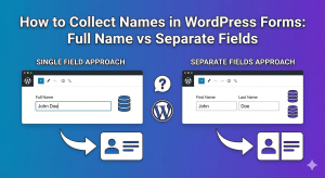
Should you use one field or multiple fields for names? Learn the pros and cons of each approach and how to set up name fields in WordPress.


Learn how to add email confirmation fields to your WordPress forms. Prevent typos and ensure you collect valid email addresses every time.

Should you rely on email notifications or store form submissions in your database? Compare both approaches and learn when to use each.
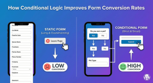
Learn how conditional logic improves form conversion rates. Discover why shorter, personalized forms get more completions and better quality leads.

Learn about Western vs Eastern name order in form design. Create inclusive forms that handle international name formats correctly.

Learn how to add range sliders to WordPress forms. Create interactive number selection with visual sliders for budgets, ratings, quantities, and more.

Learn conditional logic best practices for WordPress forms. Create better user experiences by showing relevant fields and hiding unnecessary ones.

Learn how to create form sections using HTML blocks in WordPress. Organize long forms with headings, dividers, and visual groupings for better UX.

Learn how to add password fields to your WordPress forms. Create secure registration forms with masked input and password confirmation.